Quick Summary: UX or User Experience focuses on the end user's overall experience, inclusive of perceptions, emotions, and responses to the company's product, system, or services. Hence any web designs and development agency needs to focus on the design needs of the client.

The concept of UX is the most discussed topic when designing smartphones, computers, software, and websites. UX is defined to provide ease of use, accessibility, and convenience.
Today, customers want quick and simple ways to meet their needs and solve their pain points, which is why UX matters. UX design is all about creating products that can deliver meaningful and relevant experiences to users.
You, as a designer in a UX design company, may have different clients with different needs. So, it is essential to create a brief in one format for your client, with information valuable to him.
For a marketer client, you would like to underline a few things in the brief that can enhance conversion rate, target audience, and marketer’s segmentation through design. When your client owns a development company, he may look at a project design through code and cost perspective, hence you may want to add that.
Lastly, your client is neither a marketer nor owns an IT company but wants a website or an app designed that portrays the idea of the brand. Thus you would create a brief that offers a webs design that is good-looking, clean, and have contents well-placed.
So, to summarize the aforementioned people do not share your domain knowledge thus require a little more explaining.
Along with the needs to feature in your brief, there are some common questions that must be mentioned within the brief. Such as –
Services offered by the Company or the client, company positioned in the market, the target audience, the competitors, strong and weak sides of the client’s competitors, and business design task to solve the weak areas.
How can your design attract relevant customers, what should be your goal when designing for the customer? How to design for content and branding, how would you structurize the design of the web?
You can start by looking or asking for 2-3 references that your client may like or dislike in terms of designs. Also, it is essential to have asked for a deadline.
When you have all the designing doubts sorted and have discussed the trivial parts, it’s time to move to the next step.
The goal of interactive design is to create a bridge between the user and the product through your design. These designs please users and connect with the brand easily.
Visual Designs are a combination of illustrations, photography, typography, space, layouts, and color to enhance the user experience. For making visual design a successful one, designers need to have balance, space, color, shape, and size.
This is a brilliant weapon for designers to structure and label the content so that the users find can find the information easily. Information Architecture is used for website designing, app designing, and even in the physical places where we go, for example, the city subway map.
Read Also: How To Improve Your Website’s UX

After analyzing and identifying user needs, you should think of creating a user persona, also known as a buyer’s persona. A user persona is a semi-fictional representation of your ideal customer based on data researched. This helps you better understand existing and prospective customers in order to tailor your products as well as services, content, and message for meeting the needs and concerns.
Since every user is unique and they interact with websites differently whether or not they have the same goal.
So, your goal as a designer must ensure to complete the user’s goal. Let’s say an eCommerce site must identify and have different ways embedded in the site to allow users to purchase the way they want. Moreover, making your site responsive to all kinds of devices and a lot of colorful notes for users.
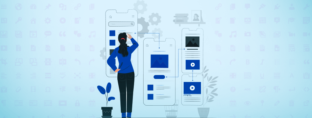
The best way to attain the user or the client’s view of the design is to provide a sketch of your design. Wireframes allow you to portray the main features, allocate space, and present images & content to the client’s site. This is how you can evaluate a product’s functionality and intended user behavior and also find potential problems or missing features that can later help in conversions.
Take this as a final draft for designing a site. The prototype of a website or app includes images, icons, font, and color inclusion. Prototype renders interactive design within a site allowing users and stakeholders to experience how the product in real-life work.
This phase is more of a user testing to uncover issues like does the checkout process asks too many clicks or whether the homepage is difficult to navigate. This is where you get the approval of the client of the design and start the development phase.
A large chunk of information is always overwhelming to take in unless someone has all the time in the world or looking for a valuable piece. So, to engage more and more audience, the best way is through breaking down the UI into parts and presenting them individually before displaying the entire UI. This approach will allow the group to have a solid understanding of how things work after they see the complete UI.
Weaving your work in a story form can gain more traction when you set a tone, context and prepare the audience for the solution you are about to present. However, it is very difficult to keep the audience engaged as they quickly lose interest, so do not keep them waiting for long.
The designing process is the process that is less discussed while working with the team of the client. But there may be a time when your client demands the process you went through to obtain a certain design. There can be several reasons, one as trying different ideas or suggestion to implement the exact idea of your client or may have broken the design pattern, or any other.
Due to anonymous constraints, designing becomes extremely challenging and successfully present or communicate work. From technical to time & effort to business motivation, constraints move your design to a specific direction and help to highlight the paths for the rest of the team.
Thus, these constraints allow everyone within the team to offer alternative solutions for the design. However, the reason behind choosing a particular path to design decision must be communicated so that the team can comprehend the reason behind. Only the designers know the reason behind putting up the respective design, and it is his job to communicate the reason before someone suggests other ways.
No design becomes successful without making mistakes and resolving them. Making mistakes will not affect unless you do not find ways to fix or prevent to avoid consequences to suffer.
You, as a UI/UX designer, can take the help of eCommerce and form design mistake-prevention techniques. The principle of anticipating user-error is called mistake-proofing.
Read Also: Why Is Website Redesign Critical For A Brand
A brilliant and successful example of UI refers to how people interact with all devices and programs. It is the process of making these things as easy to use and efficient as possible. UI mainly focuses on how the product’s surface will look and function thus the designers work with tangible and visible elements of the process.
Working on the same perspective of the development, which is designing but has their separate functionality. Some common UI terms for you to differentiate between the two:
UI designers generally use informational components to enhance the reading experience. Designers use these components to complete a task or notify an action, such as progress bars, notifications, and message boxes.
This tool is used by the UI designers to visually increase the usability of the website or app. This tool doesn’t need to have a special feature or over-the-top design, just the location of the user on a site. Also, it allows the user to see the location in a hierarchical structure.
Things like checkboxes, drop-down lists, and toggles are a part of Input controls. These controls give multiple options in response to asking questions. UI designers use input controls to provide information in simple and to-the-point for users to easily find.
Anticipating a client’s idea and outlining it into the UI/UX is challenging. What is more challenging is making that design interactive, readable, and actionable for the users. Taking a consultative approach to improving experience, determining a call to action, implementing responsive web designs, & more are a few common ways to improve user experience.
Consulting a UX Design Company can help you better. Also, you can consider some designing tools for assisting in researching, prototyping, wireframing, storyboarding, or creating graphics.
Join our growing community and get inspiring articles.
Our highly trained talented teams are committed to providing you with top-level, technical or any other support 24*7.
Ready to get started? Give us a call.