Quick Summary: In this blog, we will explore the importance of responsive web design and how it benefits both users and businesses.
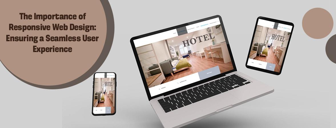
The way users access information and interact with websites has changed dramatically in the mobile era. Today’s users expect websites and applications to adapt seamlessly to any device they view it on. This is where responsive web design comes in. Responsive web design ensures a seamless user experience across devices by automatically adapting the layout to different screen sizes through flexible grids and layouts, scalable imaging, and media queries. In this blog, we will explore the importance of responsive web design services and how it benefits both users and businesses. We will cover the key elements that make a site responsive, highlight important benefits like enhancing the user experience, boosting SEO and reducing bounce rates. Finally, we will discuss some best practices for designing and developing responsive websites.
Responsive web design is an approach to building websites that makes them render well on any device, from desktop computers to mobile phones. A responsive design uses flexible grids and layouts that adapt to different screen sizes rather than serving up distinct designs for each device type. As the screen size shrinks or enlarges, the website automatically adjusts, rearranging and resizing text and images in a seamless transition. CSS3 media queries allow sections of CSS to apply only under certain conditions, such as beneath or above a certain width. This allows websites to apply distinct styling rules based on characteristics of the device used to access the site. Having a responsive design ensures users have the best experience possible on any device they choose to visit the website on.
Here are the benefits of responsive web design:
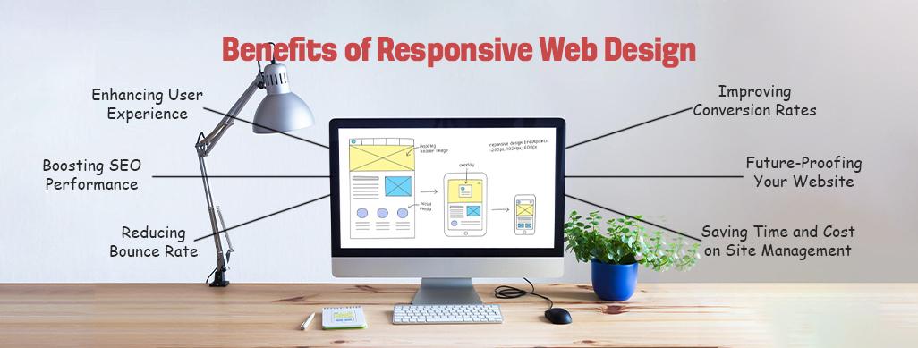
Responsive design enhances user experience by automatically adapting website layouts to any device screen size. By using fluid grids and flexible images, responsive sites ensure easy viewing and seamless navigation for users on both large desktop displays as well as smaller mobile screens. A web design company developed a responsive website for a client that sells musical instruments online. With responsive design, customers can now browse products, read reviews and make purchases just as conveniently on their phone as they would on a laptop or tablet. Customers are no longer frustrated by small text, cropped images or broken layouts that plague non-responsive websites viewed on mobile. They can switch between devices smoothly without interruptions to their online shopping experience. By enhancing usability across all devices, responsive design has significantly improved customer satisfaction for the company.
Responsive web design boosts SEO performance by optimizing websites for all devices. Website Development Services in the city developed a new responsive website for their client, an online retailer. By implementing a responsive design, the site is now easily accessible on both desktop computers and mobile devices. This allows the content to be properly indexed by search engines regardless of how users search and access the site. With a responsive layout, the site ranks well in search results for key product keyword phrases, whether someone is performing a desktop or mobile search. Users can now seamlessly access the content they need from any device, leading to increased time on site and greater customer satisfaction. The improvements have directly contributed to an overall rise in search engine traffic, leading to more leads and sales for the retailer. Responsive design helps boost SEO by enhancing the user experience across all platforms.
Responsive web design helps reduce bounce rate by optimizing the user experience across all devices. Website Development Services recently redesigned their client’s home improvement website using a responsive framework. By reformatting content and images flexibly based on screen size, the new mobile version loads faster and is easier to navigate on smartphones. Users are no longer quickly leaving the site out of frustration from tiny text, broken layouts, or large file sizes that slowed page loads. With larger click targets and intuitive scrolling, customers can now complete common tasks like finding product specifications or accessing FAQs more efficiently straight from their phones. This enhanced mobile experience encourages engagement and time on site. Since the redesign, analytics show a significant decrease in the percentage of users that bounce after viewing only one page. The responsive site better satisfies user needs and fosters increased conversion rates.
By optimizing the user experience across all devices, responsive web design helps improve conversion rates. When a leading e-commerce site redesigned with a responsive framework, their mobile usability and overall conversions saw drastic increases. Users can now seamlessly browse products and complete purchases from any device without friction in the process. This allows customers to convert regardless of whether they arrived on the site from desktop or mobile. By ensuring the same seamless shopping experience regardless of screen size, customers are more likely to follow through with purchases instead of abandoning their carts mid-process. The site saw double digit growth in items ordered per customer after launching their new responsive design. Enhancing the usability of the site through responsive design removed barriers that had previously prevented conversions. This improved user experience ultimately boosted overall revenue for the company.
One of the key benefits of responsive web design for a web design company is that it saves considerable time and money spent on site maintenance and management. With a responsive site, the web design company does not have to create and maintain separate mobile and desktop versions of the website. All content and codebases remain the same, significantly reducing development costs. It also means the company’s developers do not need to make changes in multiple places each time an update is required. Having a single responsive codebase ensures changes are automatically reflected on all devices with just one update. This leads to huge savings in resources that would otherwise be spent on managing multiple sites. As mobile traffic continues rising, a responsive design ensures the company’s sites perform well on any device, saving on costly site redesigns down the line to accommodate different screens.
Responsive design that a web design company must consider is how it future-proofs their clients’ websites. With mobile and tablet traffic continuing to surge yearly, an increasing number of users will rely solely on these devices to access the internet in the coming years. A responsive site built with flexibility in mind positions the company’s clients well to engage with these evolving user behaviors and preferences. As new device sizes and screen aspect ratios emerge, a responsive site will seamlessly adapt without requiring redesigns or updates. This protects the company’s clients from sizable redesign costs and ensures their sites remain usable, search engine optimized and consistent across all devices. Future-proofing through responsive design also keeps the client’s websites relevant for longer. It allows the web design company to focus resources on adding new features instead of reworking sites to stay current with technical progress.
Here are the key elements of responsive web design:
Here are some best practices for responsive web design:
In today’s digital world dominated by smartphones and tablets, having a responsive website is essential to satisfy user needs and achieve business objectives. While it requires additional planning and coding during development, the payoff of responsive design far outweighs the costs in the long run. By thoughtfully considering users, search engines and site analytics, businesses can craft responsive websites that boost conversions, engagement and overall success. Following proven responsive development practices ensures a seamless experience every time for users browsing across different devices. When responsiveness is prioritized, both customers and websites are set up for consistent fulfillment no matter the changing landscape of technology. Responsive design has become invaluable for meeting users where they are online.
Join our growing community and get inspiring articles.
Our highly trained talented teams are committed to providing you with top-level, technical or any other support 24*7.
Ready to get started? Give us a call.